Consistency Builds Branding Trust
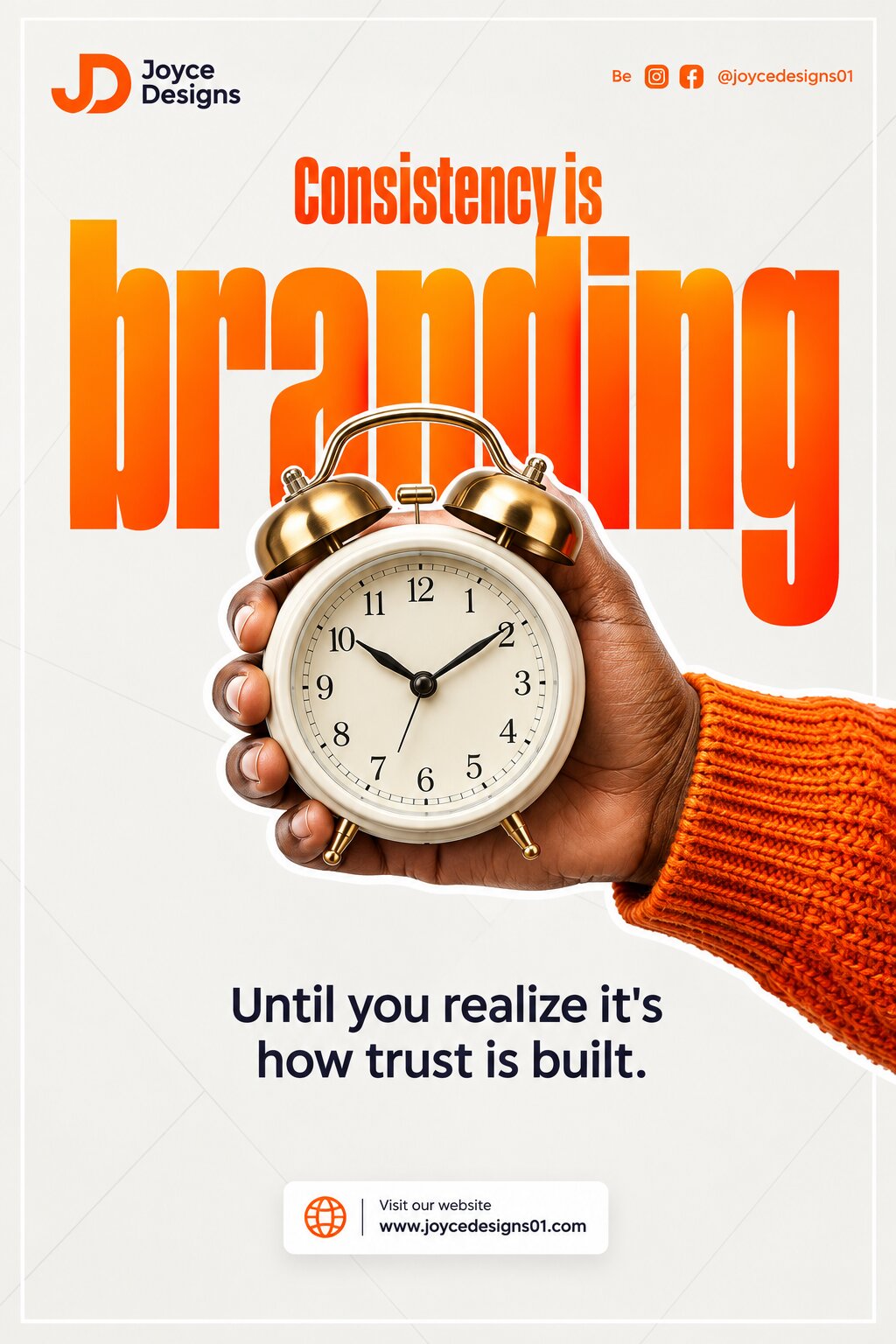
Create a premium modern branding/marketing poster focused on the concept of consistency and trust, combining bold editorial typography, a striking photorealistic human-object composition, clean graphic design, and a vibrant orange, white, and black brand palette.
FORMAT & COMPOSITION
- Vertical 4:5 portrait poster
- High-resolution professional social-media advertising design
- Clean white/light-gray background
- Thin white rectangular border inset slightly from the edges
- Subtle geometric line pattern across the background, consisting of very faint intersecting diagonal/abstract lines
- Strong central composition with oversized typography behind the hero object
- Modern branding-agency / graphic-design portfolio aesthetic
- Balanced negative space
- Crisp, polished commercial finish
BRANDING — TOP LEFT
Place a small professional logo in the upper-left corner.
Logo concept:
- Stylized “JD” monogram
- Bright orange/red-orange graphic mark
- Black text beside it reading:
Joyce
Designs
Use a clean modern sans-serif typeface.
SOCIAL MEDIA — TOP RIGHT
At the upper-right corner, add:
Be [Instagram icon] [Facebook icon] @joycedesigns01
- Orange icons and text
- Small, clean typography
- Keep aligned horizontally
- Professional social-media branding treatment
MAIN TYPOGRAPHY
Create enormous, bold, condensed typography occupying most of the upper-middle background.
The main word should read:
branding
Use an extremely tall, heavy condensed sans-serif typeface.
- Lowercase
- Massive scale
- Orange-to-red/orange gradient or subtle orange tonal variation
- Typography should extend vertically behind the central hero object
- The word should partially disappear behind the clock/hand
- Strong editorial poster aesthetic
Above it, centered near the top of the large word, add:
Consistency is
- Tall condensed bold font
- Orange/red-orange
- Much smaller than “branding”
- Clearly legible
HERO VISUAL — HAND + ALARM CLOCK
In the center/lower-middle section, create a highly realistic photographic cutout of a human hand holding a classic alarm clock.
HAND
- Realistic adult hand with natural skin texture
- Hand entering from the right side
- Fingers wrapped naturally around the clock
- Photorealistic skin details, highlights, folds and shadows
- Wearing a textured orange knitted sweater
- Sleeve visible on the right side
- Warm orange sweater strongly reinforces the brand palette
ALARM CLOCK
The hand holds a classic vintage twin-bell alarm clock facing directly toward the viewer.
Clock characteristics:
- Cream/off-white circular body
- Metallic polished gold/brass bells and hardware
- Two classic bells on top
- Rounded analog clock face
- Black hour markings
- Black hands
- Clearly visible numbers
- Premium realistic materials
- Warm studio lighting
- Subtle reflections on the brass
- Highly detailed photorealistic appearance
The clock and hand should appear as a clean photographic cutout, surrounded by a subtle white outline/sticker effect that separates the subject from the background.
VISUAL METAPHOR
The composition should visually communicate:
Consistency → Time → Trust → Strong Branding
The alarm clock represents time and consistency, while the oversized word “branding” establishes the broader business/brand context.
SUPPORTING MESSAGE
Below the hero image, centered on the page, add the exact text:
Until you realize it's
how trust is built.
Use:
- Clean modern sans-serif
- Black/dark charcoal
- Medium weight
- Two lines
- Center aligned
- Comfortable spacing
- Highly legible
FOOTER CTA
At the bottom, create a small white rectangular CTA box with subtle shadow.
Inside it place a small orange globe/web icon followed by:
Visit our website
www.joycedesigns01.com
Typography:
- Small professional sans-serif
- Black/dark charcoal text
- Orange website/globe icon
- Clean corporate presentation
COLOR PALETTE
Primary:
- Vibrant orange
- Red-orange
- White
- Very light gray
- Black/dark charcoal
Use orange consistently throughout:
- Main typography
- Logo
- Social icons
- Sweater
- Footer icon
- Small graphic accents
LIGHTING & IMAGE QUALITY
- Photorealistic commercial photography
- Warm directional lighting
- High detail
- Realistic skin texture
- Realistic fabric texture
- Metallic reflections on the alarm clock
- Soft natural shadows
- Slight high-key studio aesthetic
- Sharp central subject
- Clean professional compositing
- No excessive effects
DESIGN STYLE
The finished poster should look like a high-end graphic designer's branding campaign, combining:
bold typography + photorealistic cutout photography + minimalist Swiss-inspired layout + contemporary African/modern branding aesthetic + orange corporate identity.
Keep the design sophisticated, clean, highly legible, and visually balanced.
Important text accuracy: Render all requested text exactly as written, with correct spelling and punctuation. Do not add extra slogans, text, logos, or watermarks.
Create a premium modern branding/marketing poster focused on the concept of consistency and trust, combining bold editorial typography, a striking photorealistic human-object composition, clean graphic design, and a vibrant orange, white, and black brand palette.
FORMAT & COMPOSITION
- Vertical 4:5 portrait poster
- High-resolution professional social-media advertising design
- Clean white/light-gray background
- Thin white rectangular border inset slightly from the edges
- Subtle geometric line pattern across the background, consisting of very faint intersecting diagonal/abstract lines
- Strong central composition with oversized typography behind the hero object
- Modern branding-agency / graphic-design portfolio aesthetic
- Balanced negative space
- Crisp, polished commercial finish
BRANDING — TOP LEFT
Place a small professional logo in the upper-left corner.
Logo concept:
- Stylized “JD” monogram
- Bright orange/red-orange graphic mark
- Black text beside it reading:
Joyce
Designs
Use a clean modern sans-serif typeface.
SOCIAL MEDIA — TOP RIGHT
At the upper-right corner, add:
Be [Instagram icon] [Facebook icon] @joycedesigns01
- Orange icons and text
- Small, clean typography
- Keep aligned horizontally
- Professional social-media branding treatment
MAIN TYPOGRAPHY
Create enormous, bold, condensed typography occupying most of the upper-middle background.
The main word should read:
branding
Use an extremely tall, heavy condensed sans-serif typeface.
- Lowercase
- Massive scale
- Orange-to-red/orange gradient or subtle orange tonal variation
- Typography should extend vertically behind the central hero object
- The word should partially disappear behind the clock/hand
- Strong editorial poster aesthetic
Above it, centered near the top of the large word, add:
Consistency is
- Tall condensed bold font
- Orange/red-orange
- Much smaller than “branding”
- Clearly legible
HERO VISUAL — HAND + ALARM CLOCK
In the center/lower-middle section, create a highly realistic photographic cutout of a human hand holding a classic alarm clock.
HAND
- Realistic adult hand with natural skin texture
- Hand entering from the right side
- Fingers wrapped naturally around the clock
- Photorealistic skin details, highlights, folds and shadows
- Wearing a textured orange knitted sweater
- Sleeve visible on the right side
- Warm orange sweater strongly reinforces the brand palette
ALARM CLOCK
The hand holds a classic vintage twin-bell alarm clock facing directly toward the viewer.
Clock characteristics:
- Cream/off-white circular body
- Metallic polished gold/brass bells and hardware
- Two classic bells on top
- Rounded analog clock face
- Black hour markings
- Black hands
- Clearly visible numbers
- Premium realistic materials
- Warm studio lighting
- Subtle reflections on the brass
- Highly detailed photorealistic appearance
The clock and hand should appear as a clean photographic cutout, surrounded by a subtle white outline/sticker effect that separates the subject from the background.
VISUAL METAPHOR
The composition should visually communicate:
Consistency → Time → Trust → Strong Branding
The alarm clock represents time and consistency, while the oversized word “branding” establishes the broader business/brand context.
SUPPORTING MESSAGE
Below the hero image, centered on the page, add the exact text:
Until you realize it's
how trust is built.
Use:
- Clean modern sans-serif
- Black/dark charcoal
- Medium weight
- Two lines
- Center aligned
- Comfortable spacing
- Highly legible
FOOTER CTA
At the bottom, create a small white rectangular CTA box with subtle shadow.
Inside it place a small orange globe/web icon followed by:
Visit our website
www.joycedesigns01.com
Typography:
- Small professional sans-serif
- Black/dark charcoal text
- Orange website/globe icon
- Clean corporate presentation
COLOR PALETTE
Primary:
- Vibrant orange
- Red-orange
- White
- Very light gray
- Black/dark charcoal
Use orange consistently throughout:
- Main typography
- Logo
- Social icons
- Sweater
- Footer icon
- Small graphic accents
LIGHTING & IMAGE QUALITY
- Photorealistic commercial photography
- Warm directional lighting
- High detail
- Realistic skin texture
- Realistic fabric texture
- Metallic reflections on the alarm clock
- Soft natural shadows
- Slight high-key studio aesthetic
- Sharp central subject
- Clean professional compositing
- No excessive effects
DESIGN STYLE
The finished poster should look like a high-end graphic designer's branding campaign, combining:
bold typography + photorealistic cutout photography + minimalist Swiss-inspired layout + contemporary African/modern branding aesthetic + orange corporate identity.
Keep the design sophisticated, clean, highly legible, and visually balanced.
Important text accuracy: Render all requested text exactly as written, with correct spelling and punctuation. Do not add extra slogans, text, logos, or watermarks.
Generated using ChatGPT.